VISUAL IDENTITY
Client:
BANGSAWAN
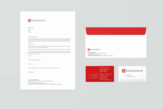
Bangsawan Group is a boutique consulting and investment firm focused on assisting small, medium-sized enterprises and start-ups in corporate consulting and capital investments.
We designed a new corporate identity for Bangsawan Group with a contemporary touch to
deliver the vision and mission to stakeholders, especially the client-oriented corporate culture.

Client:
YWAM PENANG
FAR (Foundations for Asian Reformation) twinning program attracts 18-year-old young people to earn a Christian University Degree with an accredited degree plan.
We designed a logo with the client's vision, "Bravery and Courage," in mind. This logo aims to motivate youth to make Asia better.

Client:
YUNLIN COUNTY DEVELOPMENT ASSOCIATION, TAIWAN
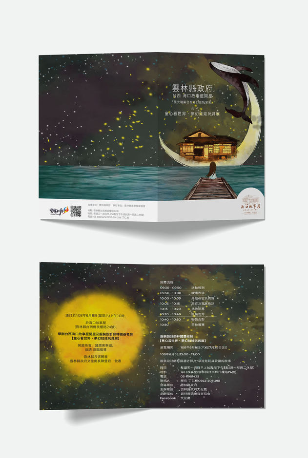
The Haikou Story house is located in Yunlin County's coastline area - Taiwan's first freshly constructed Story House. This Japanese wooden storytelling house, formerly a dormitory, has a long history. This old structure is brimming with local cultural characteristics. They are presently used to promote culture and art after renovation.

Client:
SAVE ONE'S SIGHT MISSION BHD
Save One's Sight Missions Berhad organised the Journey of Sight, a non-profit organisation dedicated to fighting and ending unnecessary blindness. Funds from this event will benefit Dogs for Sight, initiated by Save One's Sight Missions. Bring in Guide Dogs to assist the blind in becoming more agile and independent – men's best friend!
We were commissioned to deliver creative campaigns including concept and strategy, from event identity to promotional and exhibition design.

Client:
ACTION TEE
Action Tee is an innovative real estate company established with a unified vision to stay ahead of the game and develop teams throughout Malaysia and venture into international markets.
We were invited to design the brand logo to address the notion of ‘Action’. A modified type was created to represent the company's vision to take action forward.

Client:
RENG CORPORATION
Hayati is a project by Gana Eco-Resort Sdn Bhd - a member of RENG Corporation. It's a business of creating sustainable developments that give back to the local community.
We created the brand's name and brand communication. HAYATI is a Malay word that means "embracing." It is a place to embrace life wholeheartedly. Space to live, feast, laugh, dance, sing, play and breathe. To nourish our body, strengthen our mind, and
spark our soul.

Client:
CHARLIE'S CAFE & BAKERY
Charlie's Cafe is a Social Enterprise Cafe. It was founded in 2015 by
a Sabahan Couple. Their missions are to empower the indigenous communities in East Malaysia and serve the poor.
We designed the brand identity and brand communication to reflect the company's down-to-earth attitude.

Client:
DIALOGUE INCLUDES ACADEMY
Dialogue Includes Academy supports, cultivates and harnesses diverse mindsets regardless of ability or disability through the arts and music. The goal is to raise RM500,000.00 to establish Dialogue Includes Academy and contribute to the UN Sustainable Development Goals of equal education and economic opportunity for everyone and poverty elimination.
We designed the brand identity, website, and exhibition. Multiple colours were chosen as the event branding, according to the 'luminous' artwork theme.

Client:
Art Sowers
Art Sowers is an Art Movement for all Christians who are involved in creativity to come together to engage the new culture of creativity.
We designed the brand identity including naming, concept, and strategy based on their vision to empower, edify, and lift up God's creativity. We used bold typefaces and colours while staying youthful.

Client:
MISSION OPTICAL EYECARE
Vision 99 sells eyeglasses and sunglasses, but more on service, adjustment, and choosing suitable glasses for the lifestyle!
We designed a new logo with a contemporary touch to deliver the vision and mission to stakeholders, especially the client-oriented market.

Client:
VITA GROUP OF COMPANIES
Vita Group is a diversified business that includes real estate, SME startup, branding, and food chain. Vita is the Latin word for "life." In order to reduce consumer confusion, the Vita Group of Companies, as the parent company, employs a Pluralistic Branding strategy based on brands with distinct client profiles, products, and prices.
With the goals of combining caring, thinking and action to provide a wide service coverage, we create a logo that will project this message clearly.

Client:
HALF SUGAR
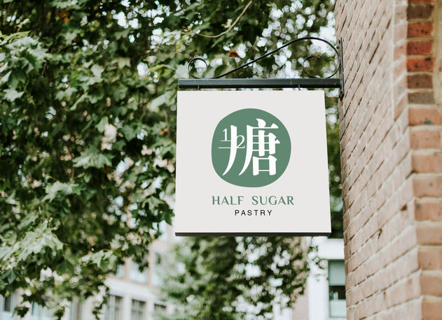
Half sugar is a locally created, artisanal pastry brand whose key selling point is its low sugar content. The majority of the clientele are health-conscious young professional women and young families. The vast majority of avenues for sales are online.
The logo is meant to represent the principles of brand identity and the philosophy of simple living through the use of a simple design style in conjunction with the logotype of Chinese sugar characters and the digits 1/2.

© 2022 by The Kern Design


